Hi there!
Thanks for visiting my website; I’m glad you stopped by! My name is Nicole, and I am a full-time photographer and author. I have much of my work over on my portfolio/print site, and you can also license some of my images on Stocksy. I also have a bunch of tutorials, books, presets, and overlays in my online store.
Please subscribe to my newsletter if you want to stay informed on what’s happening in my world. That’s where I share the latest updates on my books, blog posts, and other happenings. You can also join my free Nicolesy Community to connect with other artists and me. Hope to see you there!

— Nicole S. Young
Hi there!
Thanks for visiting my website; I’m glad you stopped by! My name is Nicole, and I am a full-time photographer and author. I have much of my work over on my portfolio/print site, and you can also license some of my images on Stocksy. I also have a bunch of tutorials, books, presets, and overlays in my online store.
Please subscribe to my newsletter if you’d like to stay informed on what’s happening in my world. That’s where I share the latest updates on my books, blog posts, and other happenings. You can also join my free Nicolesy Community to stay in touch with me and other artists. Hope to see you there!
— Nicole S. Young

FEATURED IN:


Read the Blog
Photography training, tutorials, and inspiration
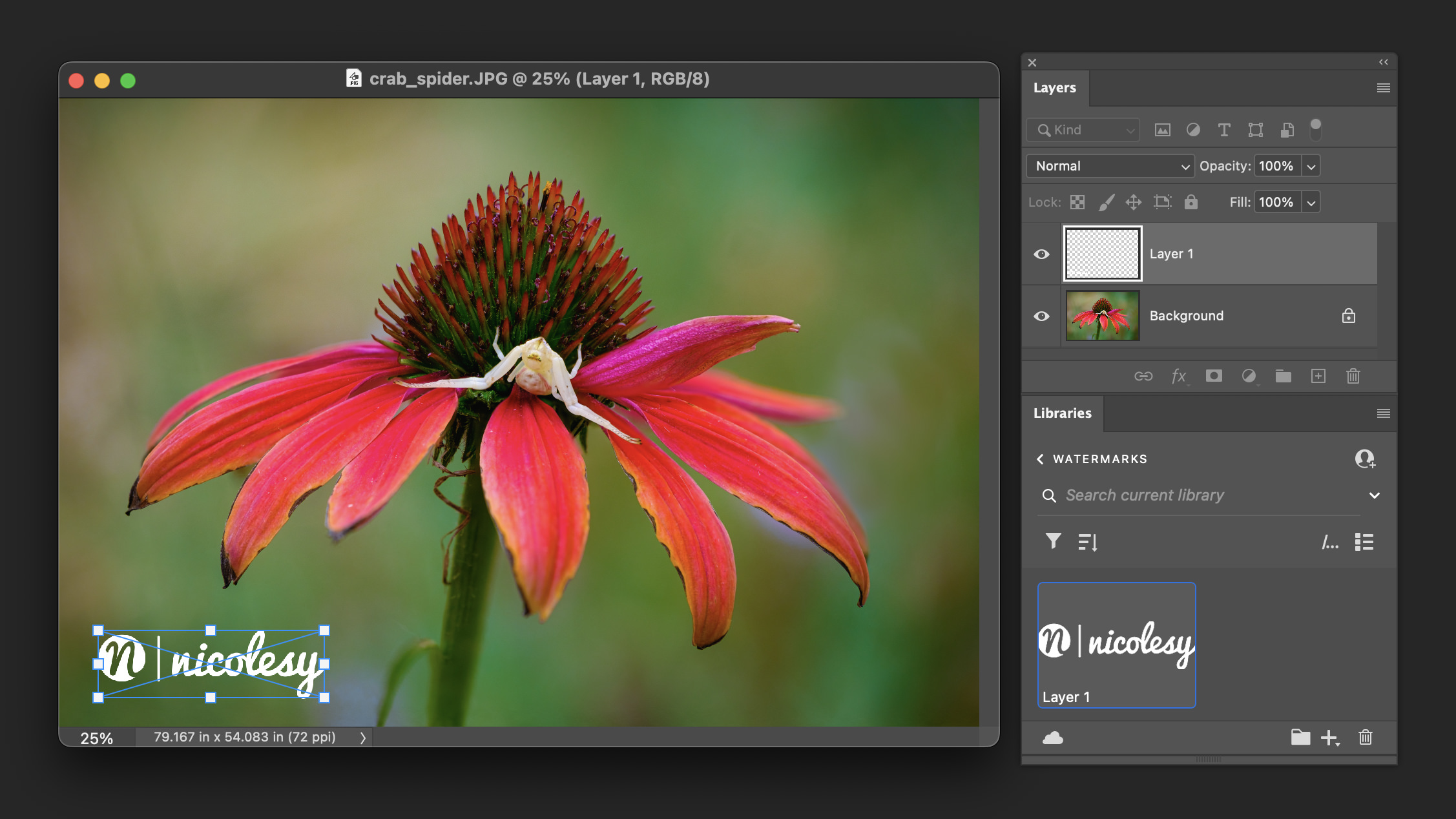
How to add a watermark in Adobe Photoshop
Adding a watermark to your photos can serve many purposes. It can help protect your images from unauthorized use, promote your brand, or even serve as a visual signature that establishes [...]
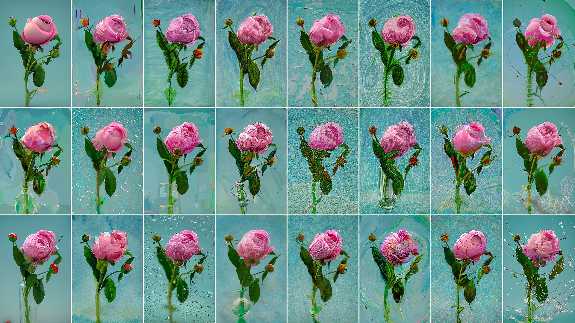
50 Art Style Prompts for Photoshop Generative AI Fill
Adobe Photoshop has always been the go-to software for photo editing and graphic design. But with the introduction of Generative Fill AI, Photoshop has taken a giant leap forward. This feature [...]

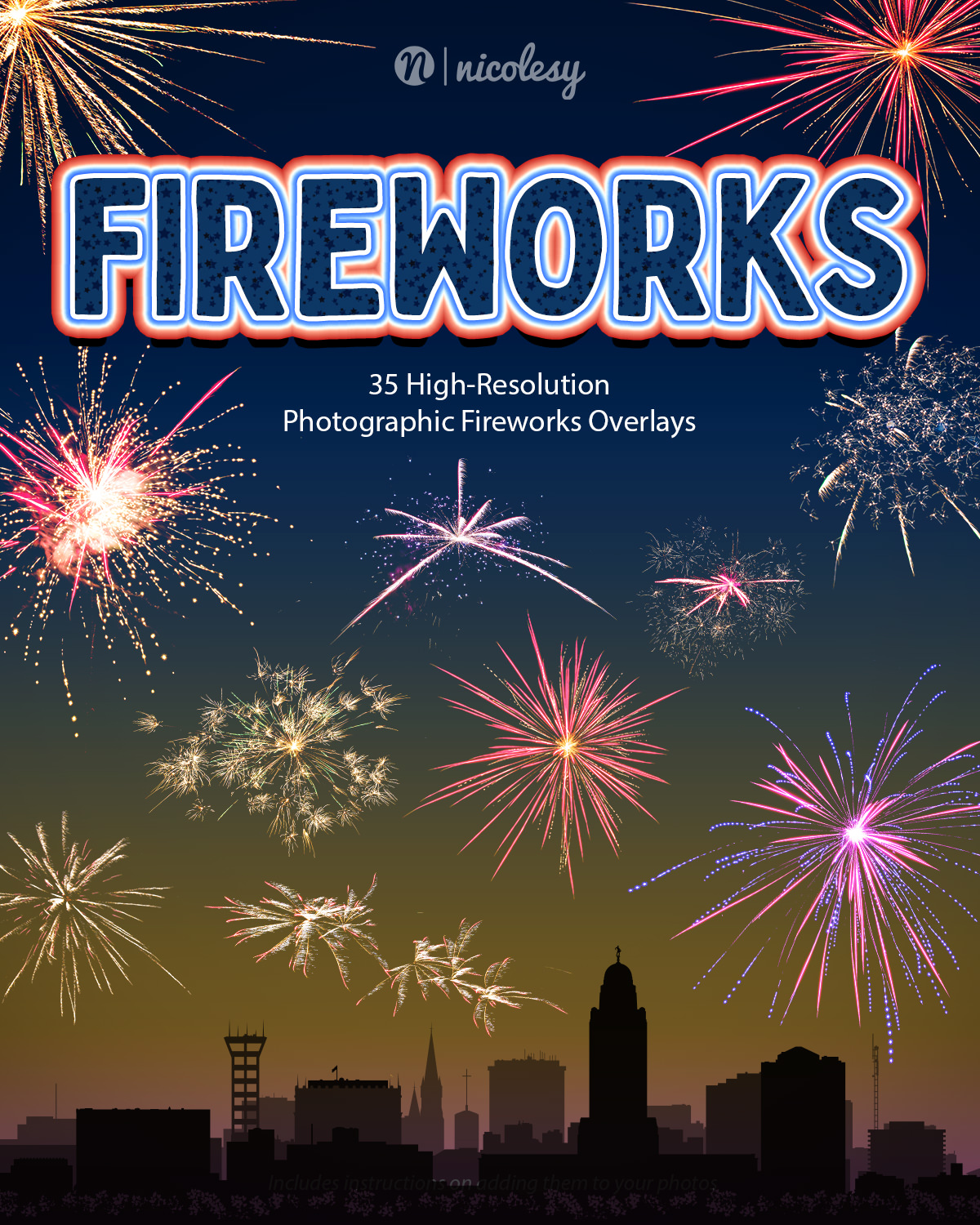
Ten Tips for Fireworks Photography
Independence Day is approaching in the United States, and many people will be out celebrating. One very traditional part of July 4th is watching large fireworks displays, and some of you [...]
WANT THE INSIDE SCOOP?
Subscribe to the newsletter and receive exclusive content directly to your inbox.
WANT THE INSIDE SCOOP?
Subscribe to the newsletter and receive exclusive content directly to your inbox.
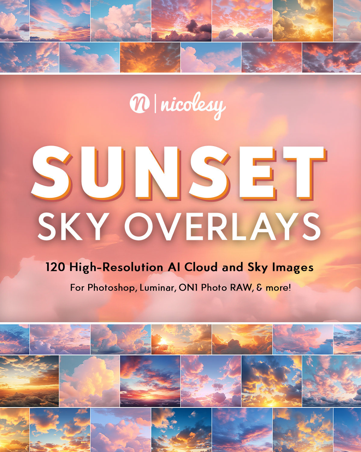
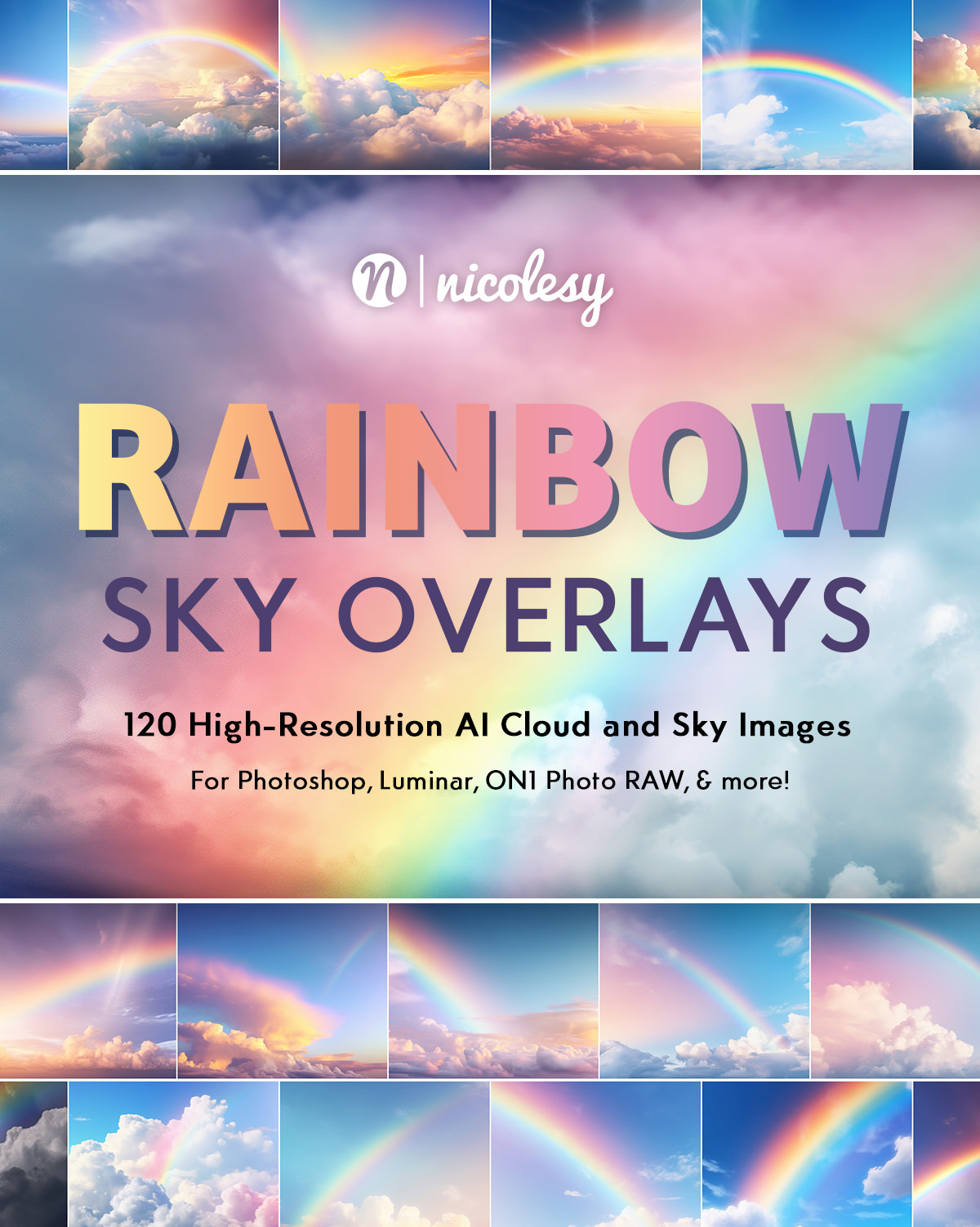
New Releases
The latest offerings in the Nicolesy Store